Once I had Search Console feeding into Looker Studio, my first dashboard was a mess. I added every field Looker Studio offered — clicks, impressions, CTR, position, device, country, query, landing page — because more data felt like more insight. It wasn’t. It was just more tabs to ignore.
What actually changed my dashboard’s usefulness wasn’t adding metrics. It was cutting most of them.
Why does a dashboard with more metrics feel less useful, not more?
Because a dashboard isn’t a data export — it’s supposed to answer a question at a glance. Every extra chart is one more thing competing for your attention, and most days you don’t need country-level breakdowns or device-split CTR. You need to know one thing: is this working, and where should I look next.
The beginners’ instinct is to build something comprehensive. The practitioner’s instinct is to build something you’ll actually open every week.
Which metrics actually earn a spot?
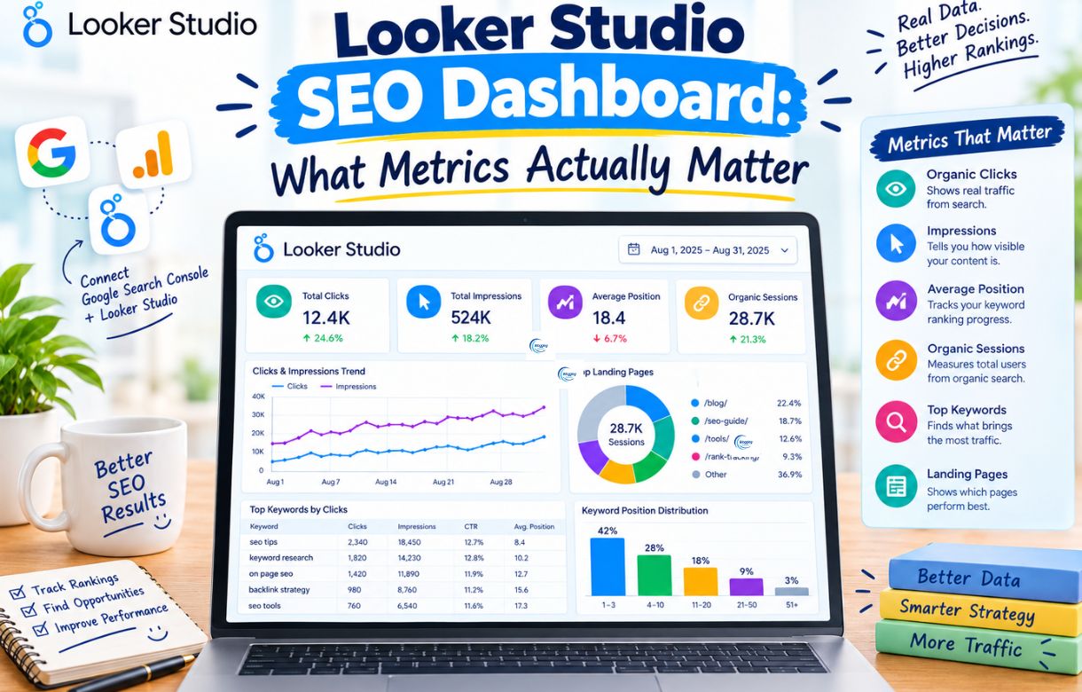
Clicks and impressions, plotted together, over time. Not as separate charts — as one chart, same timeframe, so you can see the relationship between them, not just each number in isolation. A gap opening up between the two lines — impressions rising while clicks stay flat — is usually the single most useful thing my dashboard shows me, because it tells me something’s wrong with a title or a ranking position before I’d otherwise notice.
Average CTR by page, sorted lowest to highest, on pages with meaningful impressions. This is where I find rewrite candidates. A page getting real visibility with a CTR that’s clearly underperforming similar pages is a fast, low-effort fix — usually a title or meta description problem, not a content problem.
Average position by page, not by query. Position by query gets noisy fast, especially on a smaller site — you end up staring at hundreds of rows for keywords bringing in one impression a month. Position by page is a cleaner signal for “is this piece of content actually ranking anywhere close to page one.”
That’s it. Three views. Everything else I either check occasionally by filtering the raw table, or I don’t check at all.
What do beginners over-focus on?
Country and device breakdowns, mostly. They feel important because Search Console surfaces them prominently, but for a site without a specific regional or mobile-vs-desktop strategy question to answer, they’re rarely actionable. Knowing 70% of your traffic is mobile doesn’t change anything unless you’re actively deciding whether to rebuild your mobile experience.
Raw impression counts as a success metric on their own. A page with 10,000 impressions and near-zero clicks isn’t a win — it’s the exact gap-between-lines problem the clicks-and-impressions chart is meant to catch. I’ve watched people screenshot a big impressions number as proof something’s working when the actual story, sitting right next to it, was the opposite.
Query-level granularity, too early. It’s tempting to build a dashboard filtered down to your five target keywords and watch position daily. Daily position fluctuation on individual queries is mostly noise — I found this out the hard way while figuring out why my own blog wasn’t ranking, where the page-level trend told me far more than any single query ever did.
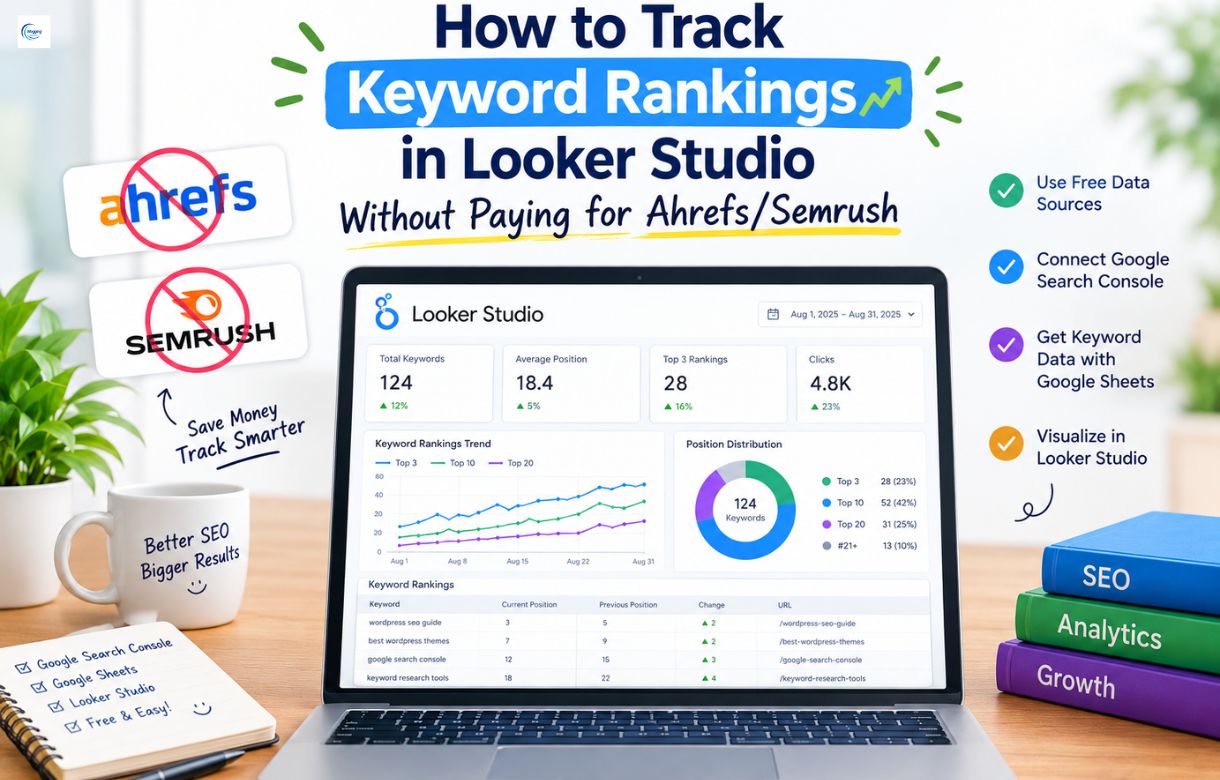
That said, once your dashboard’s core view is solid and you actually do want to watch specific keywords move over time, that’s a separate, more deliberate setup — I’ve laid out exactly how to build that view in How to Track Keyword Rankings in Looker Studio Without Paying for Ahrefs/Semrush. Worth doing once, not something to bolt onto this dashboard by default.
How many charts should a dashboard actually have?
Fewer than feels complete. My working dashboard has three charts and one filterable table underneath for when I want to dig further. That’s deliberate — if I need six charts to understand my own site’s performance, the dashboard has stopped doing its job of giving me a fast answer.
If you’re building yours for the first time, I’d start with just the clicks-and-impressions chart, use it for two or three weeks, and only add the next chart once you’ve actually gone looking for something the first one couldn’t tell you.
FAQ
Do I need Google Analytics data in the same dashboard as Search Console?
Not necessarily, and I’d avoid combining them in your first version. Search Console tells you what’s happening in search; Analytics tells you what happens after the click. Mixing both into one dashboard too early tends to produce the same clutter problem as adding too many metrics — start with one data source, get it useful, then decide if a second one earns its place.
Should I build a separate dashboard for each category of my site?
Only once a single dashboard becomes too crowded to read at a glance. For most sites, one dashboard with a page or category filter you can toggle is simpler to maintain than several separate reports.
How often should I actually look at the dashboard?
Weekly is usually enough to catch real trends without reacting to daily noise. I check mine every Monday, and dig deeper only when something in the clicks-and-impressions chart looks off from the pattern of the previous few weeks.
Is position or CTR the more important metric to fix first?
Position, generally — a great CTR on a page sitting at position 40 still won’t bring in much traffic, since almost nobody scrolls that far. CTR fixes matter most on pages already ranking somewhere on page one or two, where the audience exists, and the listing itself is the bottleneck.
Where do I go from here if I want to track specific keywords?
That’s a separate, more targeted build than this core dashboard — see How to Track Keyword Rankings in Looker Studio Without Paying for Ahrefs/Semrush for the exact filter and comparison setup.